I have been given a hypothetical medical sales representative data. The raw data comes in a spreadsheet. I am to analyze this data and provide an interactive and meaningful report. To achieve this I will be using Microsoft Power BI.
The following is the final output of our analysis:

Loading Data Into Power BI
- One option is to import an Excel workbook. Navigator will show the different tables in the workbook that can be used.

- You’ll have the choice to Load the data right away , or Transform Data and then Load, which is probably best practice. For now, I’ll load the data and then go some data cleaning techniques along the way.
- Power BI will then load the data, i.e. the tables that were selected:

-
After the data has been loaded, you’ll be able to see it in several places:
-
Fields section (tables and columns):

-
Data Model Tab (#datamodel):
-

As seen in the data model, only Reps table was automatically connected to the Sales table.
        Usually this is done automatically when column names match. We can manually connect Drugs table and Locations table to the main Sales table.

        To do this, drag Geo column to Geography in the Sales table, and Drug Product column from Drugs table to Drug Product in the Sales table.
This will form a relationship between the different databases. When hover over a line (in yellow), you will see a type of cardinality called one-to-many relationship. This is saying that each Drug Product will appear only once in the Drugs table, but can appear many times int the Sales table.
Visualizing the Data
-
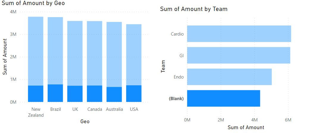
Looking sales data in each of operating locations:

You notice there’s a blank Geo location. Let’s investigate.
In the raw data, you notice that the column you notice that the Geography column cells have inconsistent spacing preceding the text. This is why it seen as blank.

The data can be cleaned in the original spreadsheet in directly in Power BI. For now, we will use Power BI.
In Power BI, click on Transform Data and it will open Power Query Editor, where the magic happens:

To remove spaces in the beginning or end of text in a cell, we would go for Trimming function:
Right-click on column > Transform > Trim
NOTE: the raw data is untouched, changes are made at the Power BI level.

Blank bar has been removed and the graph is populated correctly.
-
Let’s look at the amount by each Med Rep individually:

This graph might be a bit too detailed, let’s generalize this my team.
-
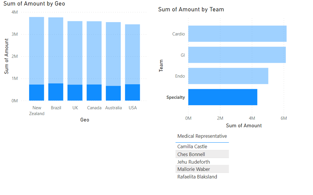
Med Rep team sales performance:

Similar problem as before, we have a *********blank bar.*********
Clicking on a the Blank bar will reflect in the Sum of Amount by Geo chart as well, the highlighted bars correspond to the “blank” teams.
This could be a useful feature for further investigation in the given data.
By adding a table, it can give us an idea of the med reps that don’t belong in a team, hence the “blank”:
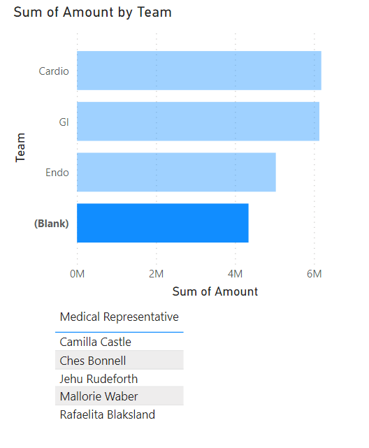
*Visuals in Power BI are interactive!*
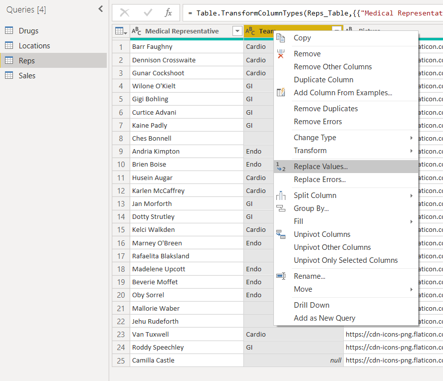
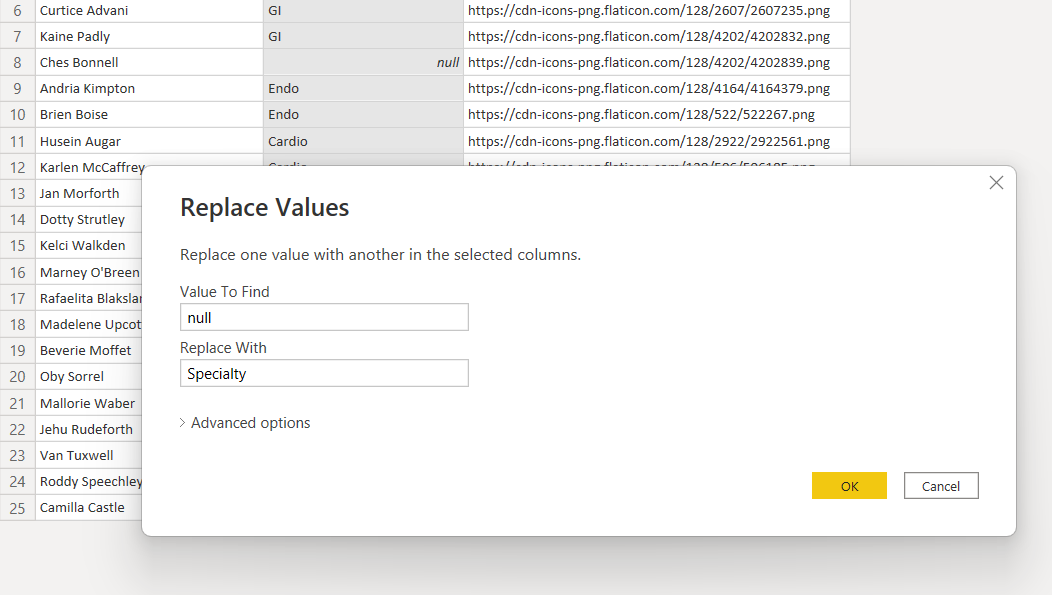
Going back to the original data in Power BI, you’ll see that there are some Medical Reps that don’t belong in a team.
You may want to associate them to a different team, such as Specialty team.
We will then transform data, which will open Power Query Editor: the blank appear as ****null****, then we can set a rule to replace those values.
Here, you can the chart has been updated with Specialty team, and the table reflects those team members.
Business Analysis
In this portion, we will add a New Sheet to do the analysis in, different from the visualizations sheet.
Med Rep sales performance analysis:
We will use a table to display med reps and their total sales:

Power BI will do the calculations automatically.
However, we can define the calculation logic manually:
Right-click Sales table, select New measure.

Power BI will open the formula bar for use to define the measure logic:

These calculations are done through a language called DAX (Data Analysis Expressions).
Creating a measure showing how DAX works:

Don’t forget to commit the formula with ✅.
Measures denoted with calculator symbol.

Format the new measure to currency:

Formatting the table can be done under Visualizations tab.

Add a slicer to easily select each team to view respective information in the table:

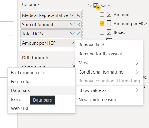
Creating a new measure: Total HCPs:

Creating a new measure: Amount per HCP (composite DAX):

Show Amount Per HCP by using conditional formatting:

How well are sales in various based on Drug Class and in which locations:
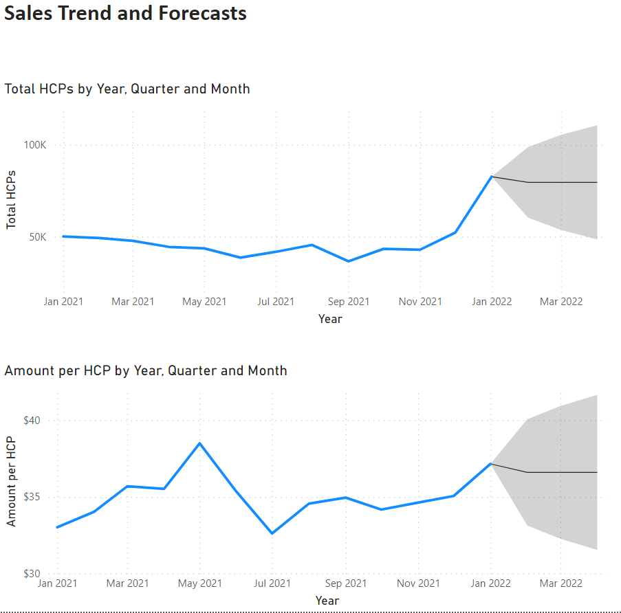
Trend Analysis & Forecasting:
- HCP Trend:
- How many HCPs are we serving daily.
- Look at trend.
- Forecast for the following year.
To understand a trend, use a line chart. Also, need a measure on HCPs column.
First, create a new measure on HCPs. Since we already have a measure named HCP, for this trend analysis we’ll use HCPcustomer:


Overall trend based on dataset (not real-world representation).
Stratify by product Drug Class:

Drag Drug Class into Legend field.

To provide for insight and analysis, got to Analytics under Visualizations tab:

But to be able forecast, one series only must be on the chart, not multiple series.
Remove Drug Class from Legend. Then you will see the Forecast option:

Customized the forecast parameters as needed:


Final Output